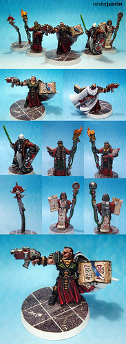
I got the final okay on this order just today and except for some clean-up on the bases (that I noticed in the photos) it's ready to go out.
This is the first time I've done a squad or unit to a mixed quality. In this case the Inquisitor was painted to the "Tabletop" standard
* and the retinue was painted to "Gaming" standard. Shared colours, the excellent bases the client provided, and a unified theme managed to bring these models together though and I'm happy with the results.
*Note to self: replace the "tabletop" and "gaming" mumbo-jumbo with "Tier 1" and "Tier 2" -- it's makes just as little sense but it's easier to keep straight.
Labels: Commission, Daemonhunters, GW, Inquisitor

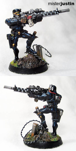
Another four hour model - this one managed to come in slightly under the allotted time. Unfortunately my lighting doesn't let me capture the various shades of blue that build up on the black armor and this will ship back to the client before I can fix that.
While I'm pleased with the final result it's not a very exciting model. As GW seems to be moving more and more to plastic models I hope to see an assassin boxed set at some point. The conversion possibilities would be interesting to play with.
Labels: Assassin, Commission, GW, Inquisitor

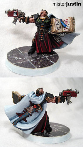
With the exception of not knowing whether the base rim should be white or black I'm ready to call this one finished. The piece came in at almost exactly the four hour mark and I'm happy with the results.
Between this model and the Vindicare I am also finally feeling a real need to upgrade the lighting I use for photos. A great deal of the layering and highlighting is totally lost in the picture. The red looks passable in the photo - but includes five layers before the final highlight that are largely invisible.
Labels: Commission, Daemonhunters, Inquisitor

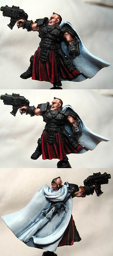
I received a second commission order from Jacob - this time for an Inquisitor and his retinue. I got to spend an hour working on this one to get the base colours set and give me a better direction for the rest of the work. In this case I was given free reign on colour decisions and plan on doing the armour in a dusty black - some freehand on the cape - and otherwise in what is present.
I chose a blue shading on the cape to add some additional depth and make it look a bit cooler. While there is still a lot of clean up to do I am happy with the overall effect and think it will look fantastic with a nice Inquisitorial symbol in the middle of it.
I'm rather pleased with how the flesh tones turned out but they're not as sooth as I might like.
Labels: Commission, Daemonhunters, GW, Inquisitor, WIP
 I got the final okay on this order just today and except for some clean-up on the bases (that I noticed in the photos) it's ready to go out.
